Created By: Jonathan
Dysart (DJJD)
Original Creation Year:
2005
Year of Re-master:
2010
Song Listing
Side A
Side B
Side C
Side D
14. Georgia Blues: Jimi Hendrix
[Does not exist on YouTube anymore]
[Does not exist on YouTube anymore]
Origin of the Album
Even
though I just finished making DJJD Volume 12, I still had a
“writer’s block” in terms of creating these albums. DJJD Volume
12 was pretty much a collection of female artists, and nothing
else. When it came to the next album, my only thought for a concept was the
number 13, which is related to “unlucky”, “superstition”, and in certain terms
“horror” – basically dark concepts.
Concept and Theme of the Album
Still
fighting my “writer’s block”, I could not decide whether to make this a horror
album or a blues album. I already started collecting two basic groups of
songs: dark-oriented songs and blues rock songs, with some bluesy
“hippie” songs. For the dark-oriented songs, I've already
collected “The House of the Rising Sun” by The Animals, “I Put a Spell on You”
by Screamin’ Jay Hawkins, “Sweet Dreams” by Marilyn Manson, and “Closer” by
Nine Inch Nails. For the blues songs, I've already collected
“On the Road Again” by Canned Heat, “The Sky is Crying” by Stevie Ray Vaughan,
and “Georgia Blues” by Jimi Hendrix.
The only idea I had was to combine them as one album, the first half being
dark-oriented and the second half being blues songs. That sounded like a
good idea, because I personally could not hear a total of 80 minutes on just
strictly dark music. It would depress me too much. The blues songs
were still somber, but not suicidal.
Starting with that concept, it was easier to fill in the rest of the album with
songs from Blue Öyster Cult, Alice Cooper, Ozzy Osbourne, Cream, Donovan, and
many others. I nicknamed this album the “schizophrenic” album, with its
“split personality”.
Except for some elements in my “Heavy Metal” album DJJD Volume 19, DJJD
Volume 27, and DJJD Volume 32, this album is by far my darkness
album, fitting right with the superstition of unlucky number 13.
Concept and the Album Cover
Since
the album is half dark and half blues (with some hippie music), I wanted to
make a cover that would reflect that. For the original version of the
album, I tried to combine the dark (represented with a haunted house) and the
blues (with an actual blues neon sign taking from Chicago), along with a hippie
peace sign, a guitar, and the album title. I was not very satisfied with
it, so I used Roxio and try to warp it to give it a surreal feel to it, but I
was not satisfied with that either.
The whole notion of redoing the album covers when I was remastering the albums
was mainly due to my dissatisfaction with this album cover. I wanted to
make a front and back cover, with the front cover representing the dark and the
back cover representing the blues.
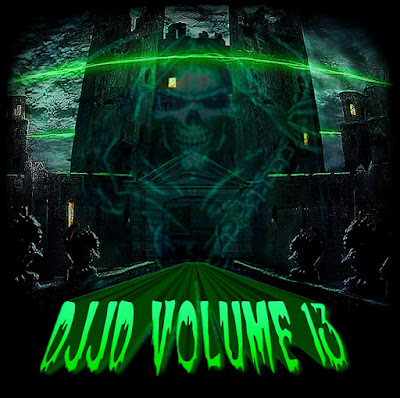
During the remastering of this album, I found a great haunted house
picture on the Internet that had the eerie green color as its
base. I wanted to overlay that picture with a picture of the “Grim
Reaper”, inspired by that Blue Öyster Cult song “(Don’t Fear) The
Reaper”. Out of about 30 pictures, I’ve found one that I could
overlay it just right, having it semi-transparent and making it
ghostly. Then I added the album title using Word Art from Microsoft
Word, and applying the same eerie green color to it. After doing
some cleaning, texturing, and minor clean ups, I finished up with front cover.
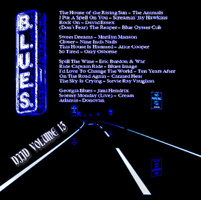
On
the back cover, I originally envisioned a straight road with an infinity
perspective, so it would represent the “crossroads” that are similar to many
blues legends. Unfortunately, I could not find anything similar to
that. Nevertheless, I did find a computer generated picture of an endless
road filled with “No Parking” signs everywhere on both sides of the road.
To me, that depicted the same “lonely” symbolism as did the traditional
“crossroads” idea. To make it fit with the blues sign that I wanted to
add, I made a black and white version of the picture, with high contrast as the
background base. Then I added the blues sign as well as the song listing
and album title (done all in white). At the end, I adjusted the contrast
of the picture and then painted it using Roxio PhotoSuite tools and deep blue
color.
Now
I was satisfied with the album covers – one showing darkness and death while
the other showing loneliness and the blues.


No comments:
Post a Comment